Bentley University - Visualizing Information Course
In March of 2021, I had the pleasure of completing Bentley University’s Visualizing Information UI UX course!
In this course, I learned how visualization enhances our ability to think. The course begins by comparing the visual and verbal worlds, their strengths and limits, and how these media interact with various thinking tasks. I examined a range of visualization formats including illustrations, icons, mind maps, decision diagrams, schematics, information maps, and dynamic visualizations. Moving from this analysis, this course shows how to design a visual-verbal system in which the strengths of one medium support the weakness of the other. This approach more fully integrates the visual and verbal message in a way that dramatically increases the reader's understanding of the information. I examined a range of visualization formats including illustrations, icons, mind maps, decision diagrams, schematics, information maps, and dynamic visualizations. I learned to use these formats to support the complex cognitive tasks of problem solving, analysis, and decision support and learning.
In order to earn credits for taking this course, we had a final project.
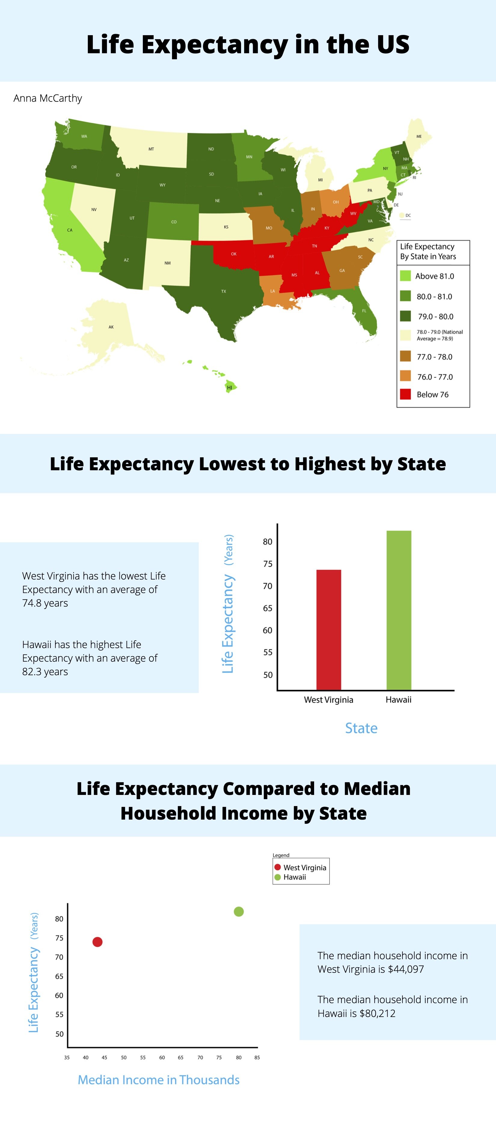
For my final project, I chose to create an explanatory information visualization, incorporating illustration and charts. I reported on the average life expectancy by state, within the US. My goal was to educate people on each state’s average life expectancy, compare and contrast lowest life expectancy to highest by state, and show the lowest life expectancy’s state median income compared to the highest life expectancy state’s median income. My audience for this information is anyone looking to educate themselves on the US life expectancy rates, as well as anyone looking to compare states’ average life expectancy range. I wanted to report on health within the United States, and started researching different data sets. I found a table of all life expectancy ranges by state. The table was very hard to read since there were 50 columns, with different averages. I wanted to make a visualization of this that was easier to digest and quickly gather information.
I chose an illustration of the United States, color coded by average range. I thought the labeled map would be easiest for viewer’s to find a specific state, and then match it with the legend to determine that state’s life expectancy range. Using an illustrated map can also help viewer’s detect patterns, to see generally different areas of the US with lower or higher averages. I included a legend with the color codes and written ranges, so viewers can map which state color indicated which age range. For the highest age range and the lowest age range within the legend, I chose bright, attention grabbing colors to show contrast and alert viewers which are essentially ‘best’ and ‘worst’. I chose green for the highest as it is usually paired with positivity, I chose red for the lowest to show a warning or danger. The average is a neutral yellow. Then, the colors start from darker to lighter before meeting their respective end of the spectrum. For my second visualization, I chose a bar graph to easily compare the differences between the state with lowest life expectancy vs. the state with the highest. I used their appropriate colors from the legend. The bar graph easily highlights the difference in amount of years from the lowest ranking to the highest. For my last visualization, I chose a scatter plot graph. Since the information is representing medians, I thought a scatter plot would show range more than a bar graph, since it is an approximation. I changed the X axis to median in thousands and then used color coded dots with a legend to determine the state. I am aware that scatter plots are typically used for large sets of data, but since the plot points are an accumulation of large sets of data (the median household income for each household within the given state), I deemed this was a correct use-case.
More information on the course can be found here: https://www.bentley.edu/centers/ux-education/ux-certificate